The point of it ...
The idea is to be able to treat your text files diachronically -- that is, studying change through time.
You might want a concordance, for example, to be ordered by the text date. Or you might be interested in knowing when a certain word first appeared in your corpus and whether it gained popularity in succeeding years. Or whether the collocates of a word like web changed before 1990 and after.
File dates display
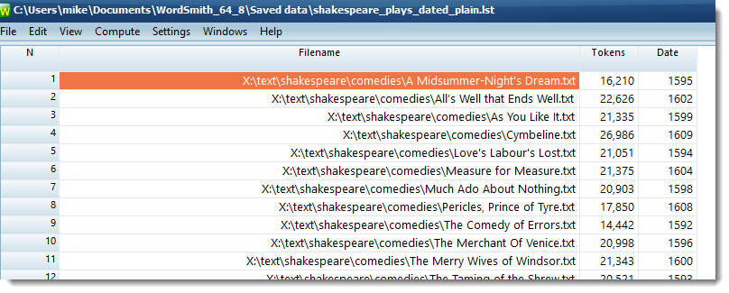
You can set the date format using the menu (View | File-dates) as you prefer.
This screen-shot shows a time-line based on concordancing love and death in these 37 Shakespeare plays.
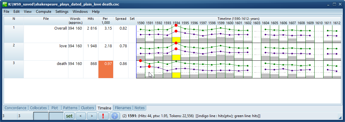
Hits shows the number of concordance entries each time-line entry is based on (more than twice as much love as death). The Per 1,000 column shows the number of hits per 1,000 tokens and Spread is the dispersion value.
The plays are dated from 1590 to 1612. None of the 37 plays appeared In 1603 or 1610. The year with the most text (yellow) is 1594
The green line records the number of hits for each search-word and the indigo line records hits per 1000 words. In the case of death, peak hits come in 1590 and peak mentions of death per 1000 words in 1591 (plays about Henry VI). The line with grey or yellow rectangles records the word-count for each segment.
As your mouse hovers over the time-line, you get information on the segment you're over shown in the status bar.
How to do it
Choose Compute | Timeline and set the period of time (weeks, months, years etc.) which your texts suit:
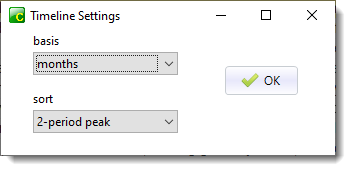
and how to sort (1-, 2-,3- or 4-period peak). Press OK.
Time-line display
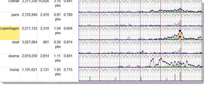
The Words column shows the number of tokens each row is based on. In the screenshot, Obama and Trump are not found in all the years, Obama is missing in these data for 2005.
The first line shows overall data where all results on 5 search-terms are merged. Each line can be pulled taller or shorter.
Concordance hits are represented as a graph with coloured lines and blobs for each time period. .
There are 2 lines, one representing hits (green line here) and one representing the per 1000 words score (indigo line).
There's a blob in each period, and the main peak in each line can have a different colour. Here red is used to mark out peak hits.
The highest point graph lines can reach is the dotted line below the dates.
There is a shaded rectangle in each period to show how much text there was in it. This is coloured grey, with a peak period rectangle coloured yellow.
 How lines and rectangles are computed
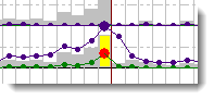
Time-line peaks and colours
The bright colours show 1-peak data. A 1-period peak is the period of time where the highest ratio of hits to word-count was obtained. The detail can be seen by double-clicking.
Double-click the time-line entry
To see the detail of an entry, double-click. Here I double-clicked the COPENHAGEN time-line and got this:
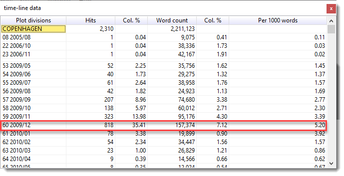
Peak hits were in November and December 2009.
Editing the data
You can as usual delete a line, choose a Set category, re-sort, and merge entries.
See also: time-line settings, keywords database time-lines, changing file dates, merging time-lines.